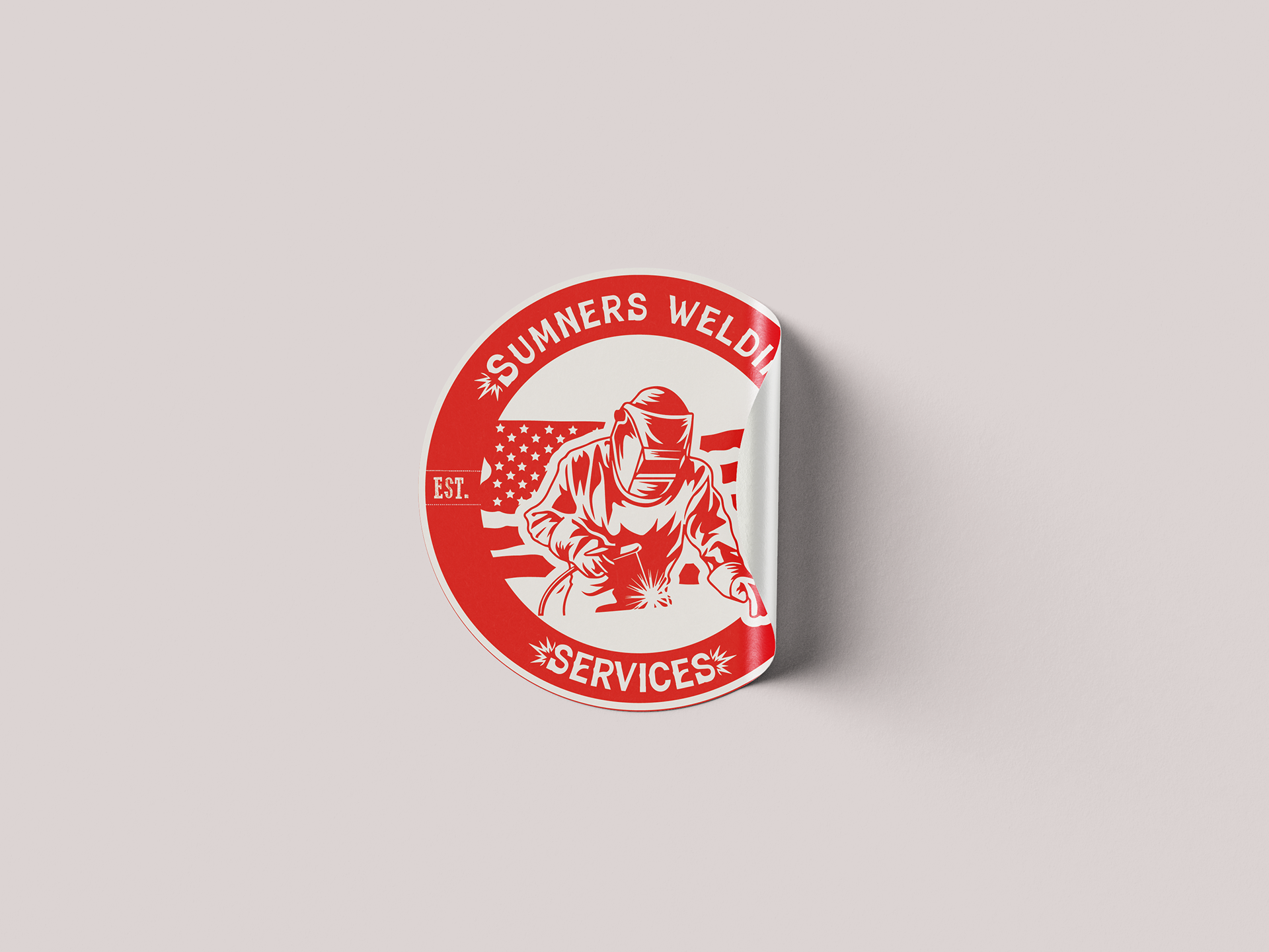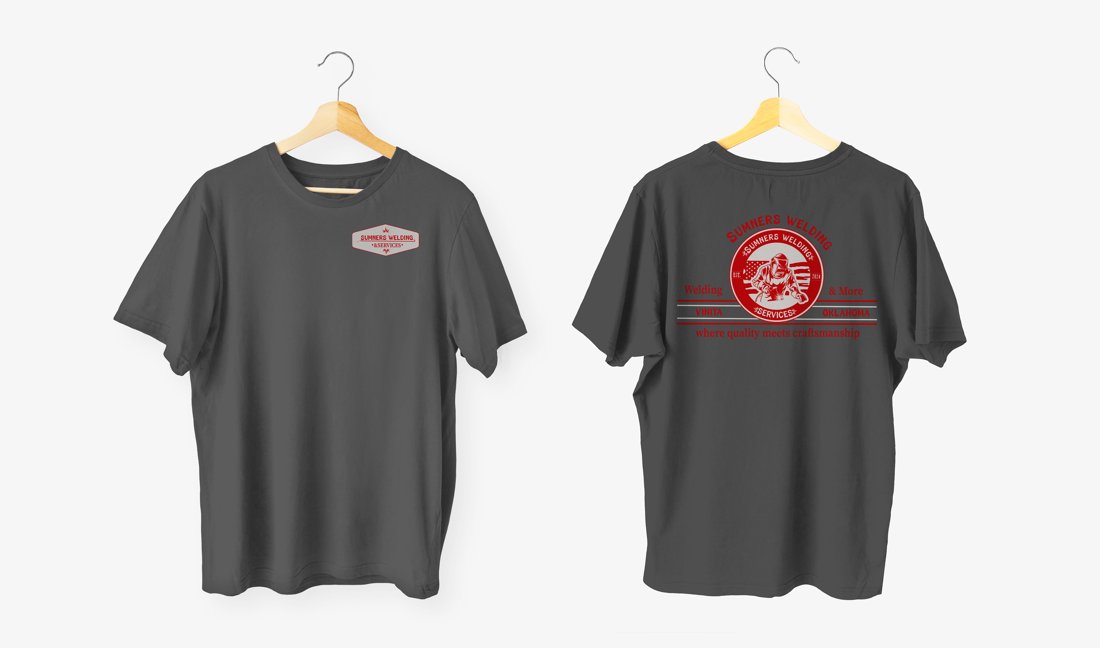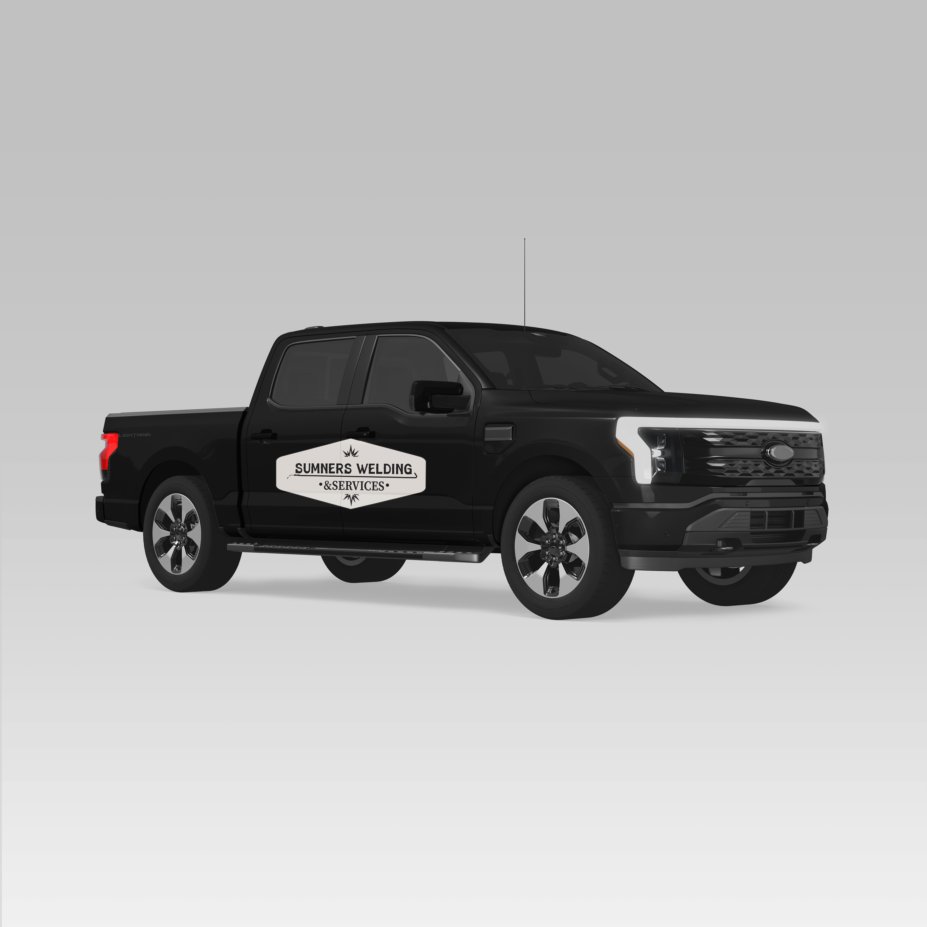
For this client I got to design them an entire branding identity package. For this I started by designing a main logo that effectively communicates the brand and what services they offer. I chose a typeface that has a vintage look symbolizing the idea that welding has been around for a long time. I went for a bright and bold red color that ties back to the sparks created when a welder is welding. As for the image in the middle of the logo, the client requested a welder that was welding and an American flag behind him. I chose to include a symbol that represents the sparks made when welding, to add an element that could be used throughout the branding to tie everything together. I then was tasked with creating a business card that was effective in communicating what exactly the client offers. I also included mockups of potential t-shirt designs and a truck magnet.